Design System
This project explores how playful, cohesive UI can support children’s routines while giving parents clarity and control. It reflects my focus on human-centered, accessible design and translating behavioral goals into intuitive, scalable systems.
.png)

Foundation
Since this design system was made for a concept project, I focused on foundational design elements like:
Typography
Colors
Components
Icons
Shadow
Illustration
Logo
Button
Design Token Strategy
To support a playful yet structured interface for children and parents, I created a design token system that turns visual decisions into reusable rules, ensuring consistency and flexibility across the product. The system balances calm, friendly visuals for children with clear, functional UI for parents.
Color Tokens
Primitive tokens are raw, brand-independent color values that form the foundation of all UI elements. The primary, secondary, and neutral colors were selected using a complementary color approach to create balanced contrast keeping the interface playful and engaging for children while remaining clear and accessible for parents. Tints and shades were generated using HSB adjustments to maintain visual consistency and accessibility.
Colors/ Primary / Primary 500 #F9CB48
Colors/Secondary/Secondary 500 #AB75B3
Colors/Natural/Natural 500 #A3A2A1

Component
Dongle was chosen for its rounded, friendly forms that improve readability and match the app’s playful, rounded visual style. Typography was kept simple and consistent by defining all styles in a single system, avoiding unnecessary layers since the hierarchy was expected to remain stable.


Typography Tokens
I created a typography token system with clear text styles for consistent use across design and development. Dongle was chosen for its rounded, friendly forms that match the app’s playful visual style and improve readability. The system was kept simple within a single hierarchy, as the typographic structure was expected to remain stable.
Token / Font/ Weight/ Size
H1 / Dongle / Bold / 40px
S1 / Dongle / Bold / 32px
B1 / Dongle / Bold / 20px

.jpg)
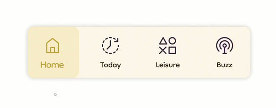
Iconography
All icons were created as 24px components. I followed a naming convention that starts with icon/ to keep them grouped and easily searchable in Figma.

Icons/ search/ Outline
.jpg)
Button Component
Main colors were defined first, with tints and shades created using HSB adjustments and tested for accessibility through contrast checks. The app includes six button types rectangular and square, in multiple sizes with text or illustrations. Each button supports six states (Default, Hover, Clicked, Disabled, Error, and Text) to ensure clear, responsive visual feedback.

Text Field
I designed this text field for my project to ensure consistent, accessible, and clear user input, with multiple states and variants for different use cases.

Illustration
Smooth transitions between screens and subtle animations for the hippo character, illustrated and designed by me, help keep children engaged and create a calm, enjoyable experience while completing tasks.

Logo
Four overlapping rounded squares, rotated at 35°, create a playful pattern. A bright yellow smiling square at the center radiates warmth, while soft pastel backgrounds reinforce the cheerful spirit of Jolly.

System Maintenance
1. Identify a Need
-
Spot missing components or gaps.
-
Note enhancements or improvements for existing elements.
-
Consider new use cases or reusable components.
3. Design & Document
-
Define the use case and reasoning.
-
Create optional mockups or examples.
-
Include accessibility considerations.
-
Document everything clearly within Figma.
2. Review & Integrate
-
Evaluate the proposed change.
-
Refine and finalize the component or token.
-
Add it to the system with clear notes
4. Versioning
-
Maintain a simple changelog in the Figma file.
-
Include notes and guidance for any breaking changes.
Reflection and Key Learnings
Design Systems Are About Communication, Not Just Consistency
This project reinforced that a strong design system is as much about clarity as it is about visuals. Well-defined tokens, naming conventions, and simple documentation make the system easier to understand and use, helping designers and developers work faster and with fewer assumptions.
Designing for Scale Requires Early Decisions
Working on the token structure pushed me to think beyond the current interface and design for future growth. By separating primitive, semantic, and component-level decisions, the system remains flexible and adaptable supporting new features, themes, and use cases without breaking consistency.
Balancing Emotion and Structure
Designing for both children and parents highlighted the importance of balancing emotional design with functional structure. The system allowed playful, calming visuals to coexist with clear, accessible UI patterns, showing how design systems can support both user experience and long-term maintainability.